I do not mind the month of January. It is the month in which we slow down, reset and get to those projects around the home that have been on the back burner since the holidays. So it was about this time last year that we were getting ready to check the last thing off our home improvement list: redoing our master bath. We knew that this was something we wanted to do when when we moved into our home six years ago. But other improvements took precedence over those years. That or course did not stop me from gathering ideas and dedicating a Pinterest and Houzz page to my dream master bath during this time.
Master Bathroom Inspo
I initially had some pretty lofty ideas as to what I wanted my master bath to look like. It is easy to get carried away with them! But of course the more carried away you get, the more expensive the project becomes! Below were some of my initial dreams!
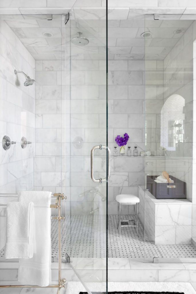
A large shower with rain overhead fixture and steam jets
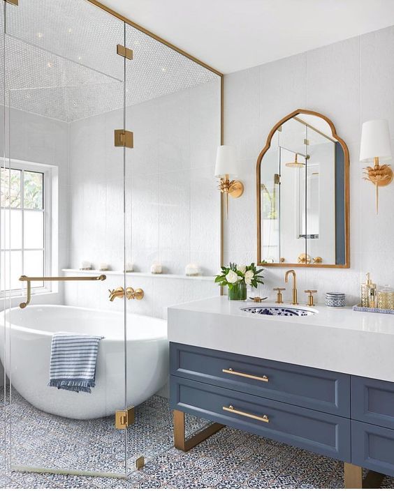
A free standing tub built within a shower
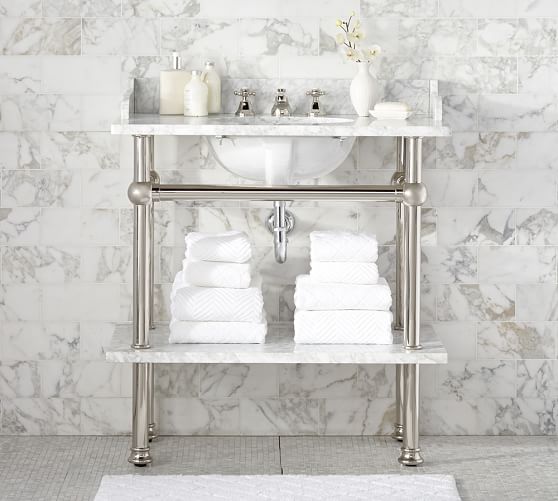
Freestanding open-framework sinks
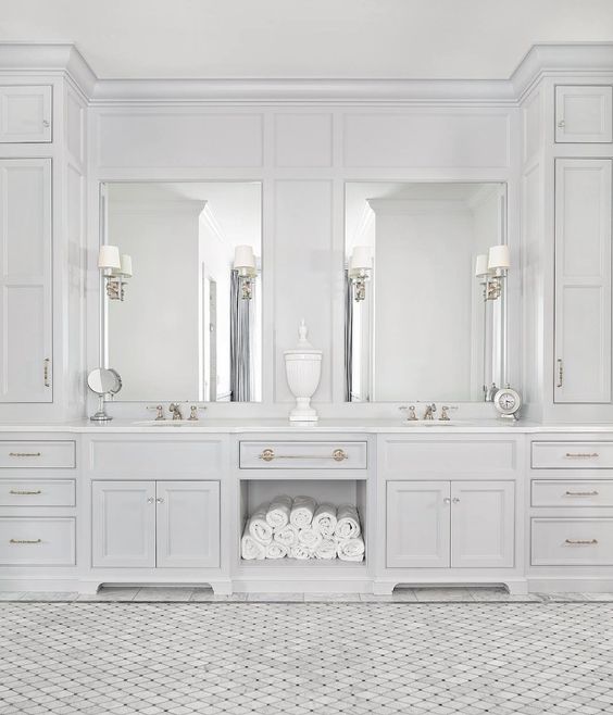
Intricate built-in cabinets and lighting
But alas when you put pen to paper and start to wrap your head around costs, my reality comes down to what can I do that will make me happy but still not break the bank!
Background on our Home
To give you a little background on our home, we currently live in the home my husband grew up in. We bought it from his mom six years ago. The home was custom built in 1961 and Rob’s parents were the second owners having lived here for over fifty years. It had been beautifully cared for and maintained but it definitely needed updating and our own personal touch added to it once we bought it.
When we finally got to the point where we were ready to undertake the master bath, Rob’s mom had just recently passed away. Whether it was emotion or just the appreciation for “things were made better back then”, we realized we did not want to change too much of what was already there. We learned to love a lot of the vintage aspects.
Master Bath Before
To give you an idea of what the before looked like, I have a highlight video you can view here: Bathroom Remodel Before Footage
As you can see, there were already a lot of beautiful marble in place. The floors, bathtub trim and vanity top are all Calcutta gold marble while our shower has book matched slabs of marble 3/4″ thick. If we were starting from scratch, these materials would not have made the budget cut. So, we decided that we wanted to preserve and work around the marble already in place.
This meant our tub had to stay. And it was not the coveted white that most master dream bathrooms are made from nowadays. It was grey. One option was to refinish it in white. Then we could replace the sinks and toilet that were also in grey. But when we went out to shop around for white options in these items, we quickly realized we loved the unique quality of what we had.
The things I wanted to part with were our bathroom fixtures, lighting, the shower door, and vanity cabinet. The only other thing that I considered preserving was the hand painted mural above the tub and the hand painted wallpaper border. We did preserve other murals in the home so emotionally I could part with it. I also knew that in order to get this bathroom looking more updated, it really needed monochromatic walls with a fresh coat of paint.
Master Bath After
I will spare you with some of the behind the scenes work that needed to done. Instead, I will jump right in to show you how we worked with what we kept to give our master bathroom the refresh it needed but without compromising on most if its original character!
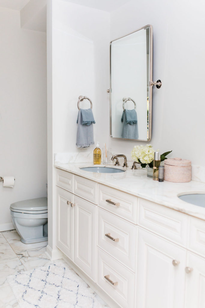
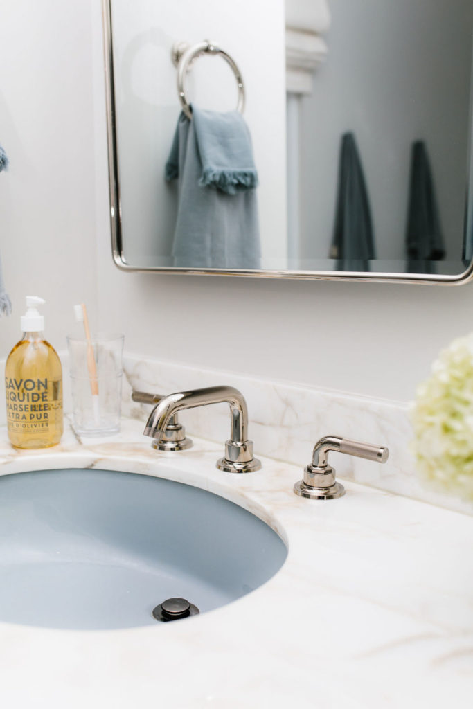
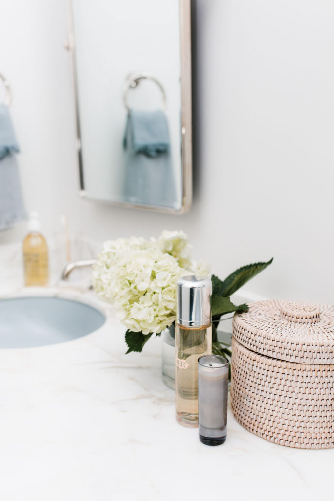
Replacing the vanity was a necessity. Our previous one was only 30″ high which is lower than what is standard nowadays. Plus it was worn and very dated. Instead we went with a more typical 36″ height vanity with raised panel doors. We were able to keep our Calcutta gold marble vanity countertop. Zannotti Tile & Stone in HIghwood, IL did a beautiful job preserving and restoring this piece for us!
Bathroom Vanity
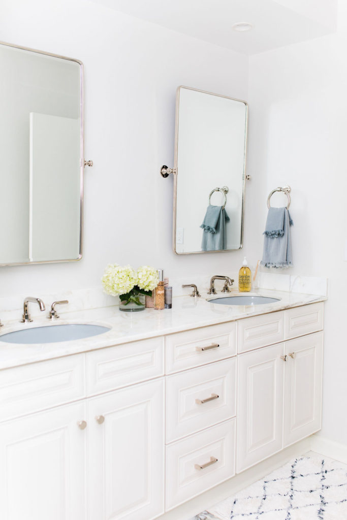
Mirrors here // Faucets here // Drawer Pulls here // Towel Rings here // Hand Soap here // Bamboo Toothbrushes here // Water Glasses here
(all finishes in polished nickel)
Its been awhile since I was in the market for fixtures! Wow! They really can get up there in price. But it was important that our fixtures were sturdy. I wanted them to feel substantial and heavy. We worked with a local company, Studio 41, to select ones we liked but didn’t put us (too) over budget. In addition, I fell in love with this collection from California Faucets. I was drawn to the clean shape and knurled finish on the handle. The finish is polished nickel.
Once I fell in love with the knurled finish, I wanted to incorporate it into the rest of the fixtures. Restoration Hardware and Pottery Barn both offered options that paired well with the faucets!
Originally we had a mirror that took up the entire length of the vanity. We planned on reinstalling it but at the last minute I changed my mind and decided on individual mirrors over the sink!
Shower
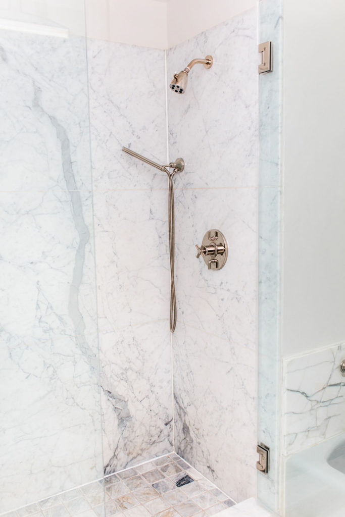
Shower Head here // Hand shower here// Shower Pressure Control here
(all finishes in polished nickel)
For our shower we worked with Inman Glass to install new doors. We kept the overhead faucet but added in a handheld shower as well. Studio 41 once again helped us source these!
Bathtub
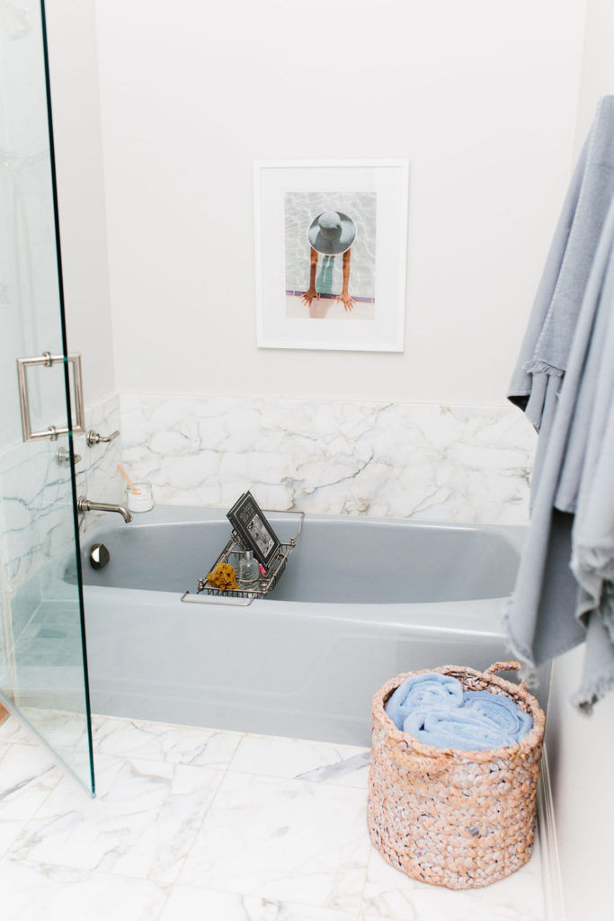
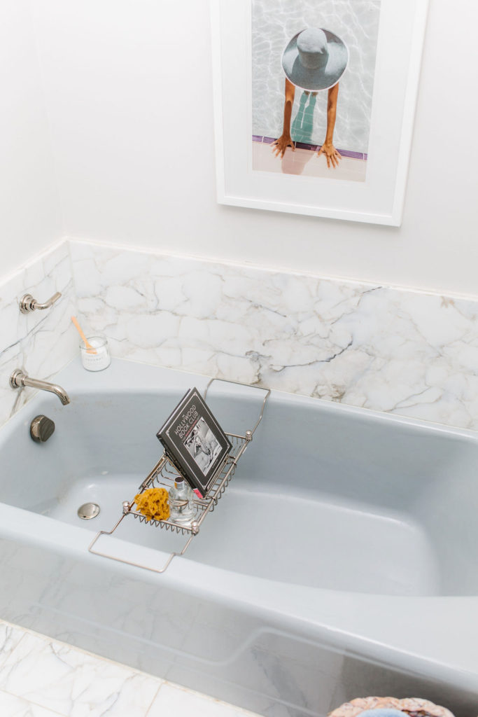
Tub spout here // Tub handles here // Bath caddy here // Art Print here // Sponge here // Bubble Bath here // Bath Salts here // Book here
(all finishes in polished nickel)
It is not the free standing white tub that has been a dream of mine to have for so long but I still am very happy we kept this. By adding a bath caddy and my favorite bath products this has quickly become my sanctuary for relaxing and unwinding. And while we did do away with the painted mural, I still love a bit of a vintage nod with this photographic print.
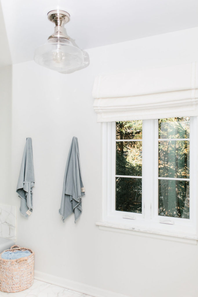
Additional Features
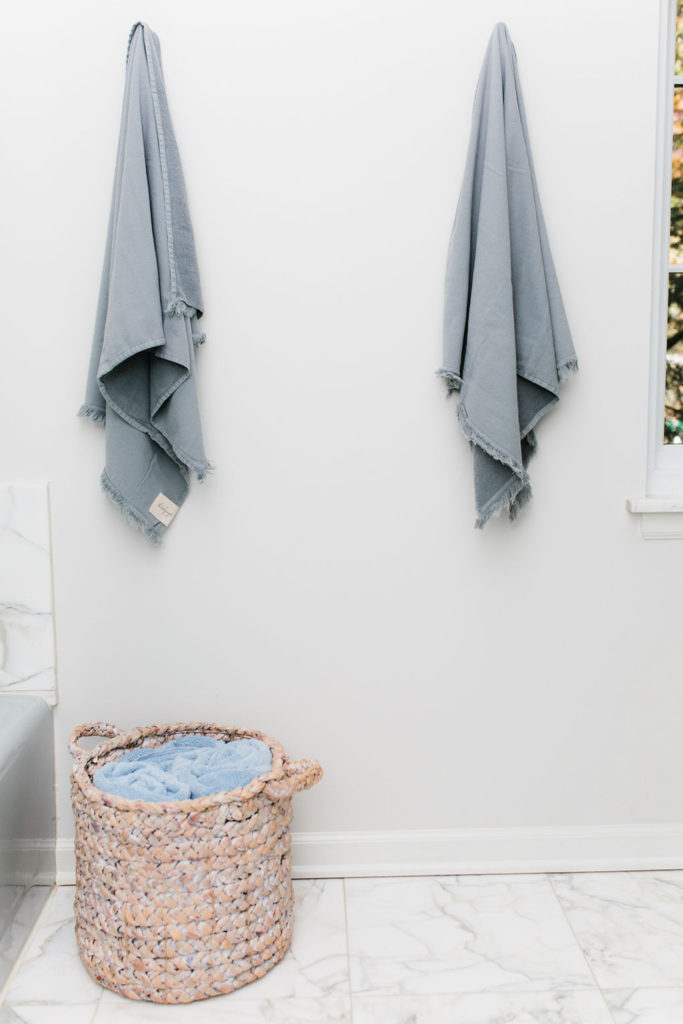
Hooks here // Towels here // Basket here // Light Fixture here
I opted against a towel rack and instead went with towel hooks. While big fluffy towels still exist in this space, I am personally a huge fan of linen towels for drying off. They absorb and dry out so much better!
I had a hard time coming up with a light fixture in here. I needed something modern yet still have a slight nod to vintage. So this is the one I ended up with after seeing it on sale at Restoration Hardware ( and it still is on sale!)
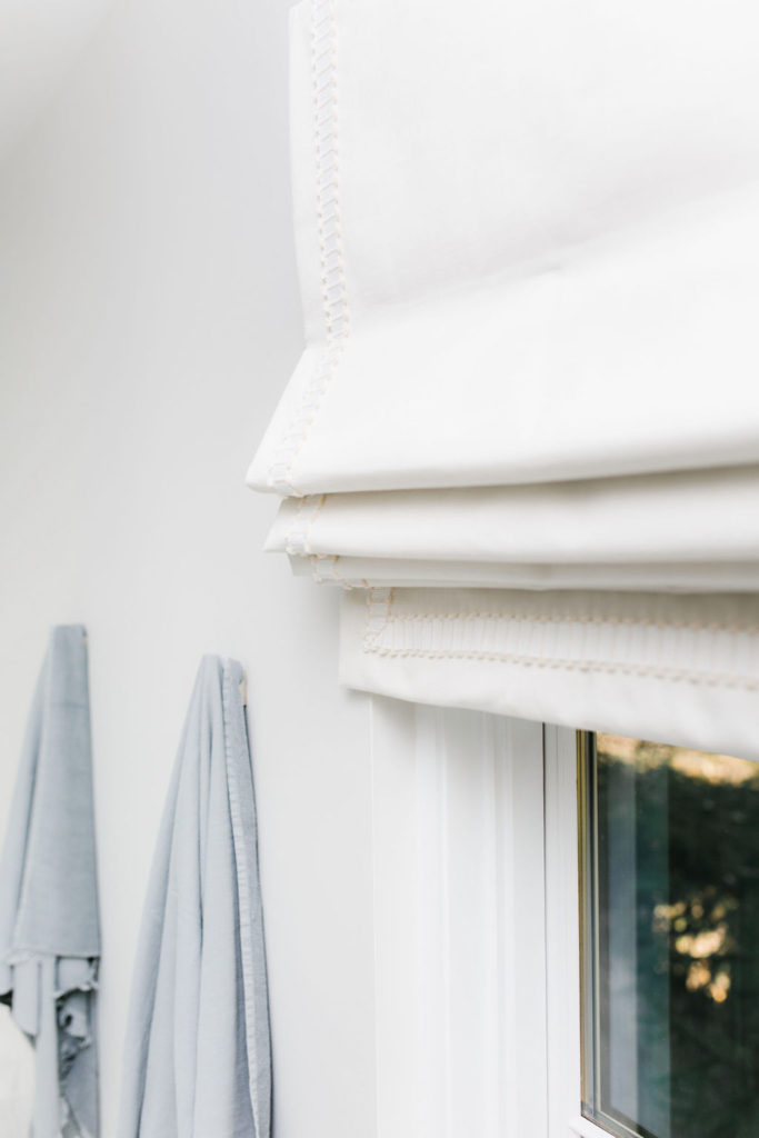
For our window treatment I headed to my local Loomcraft and bought an ivory linen off the bolt. My friend, who is an interior decorator, found the trim for me. I can provide her contact information if you would like. Simply shoot me an email!
For the paint I needed a color that worked with both grays and off-whites. We selected Benjamin Moore #856, Silver Satin.
Final Thoughts
All in all, I am happy with how our remodel turned out. Working with a lot of the existing material not only saved us on cost but it really helped maintain most of the character in this space. If you too have an older home and are looking to remodel, I just encourage you to think about some of the materials that are already in place. Even something like our toilet was worth saving (It was made in one piece and has a value of over $2000!) It is amazing how fixtures and paint alone can update a space! Houzz and Pinterest are wonderful sources for ideas whether you want to start from scratch or you are working with what you have!
Photos by Jules Kennedy
You can also follow me on Facebook, Instagram and Pinterest
Thanks for stopping by!
L, M
